The latest release of the Control Valve App brings a significant redesign focused on one core idea: giving you the information you need, right where you need it – without the clutter.
Whether you’re managing a handful of valves or an entire fleet across multiple sites, V3.0 introduces a cleaner interface, better tools for collaboration, and new ways to prioritize what matters most. Here’s what’s new.
A Redesigned Asset Dashboard
The Asset Dashboard is where engineers spend most of their time, and it now reflects that. Instead of a dense data table with a spider chart, V3.0 organizes valve information into clearly structured tiles: a Health Trajectory showing how the valve’s score has changed over time, an Asset Details card with key specifications and Remaining Useful Life, and a redesigned Issue Radar for a quick visual read on problem areas.
The standalone Reports page has been removed from the navigation. Instead, PDF reports can now be generated directly from any dashboard via a PDF icon button – faster, more contextual, and fewer clicks.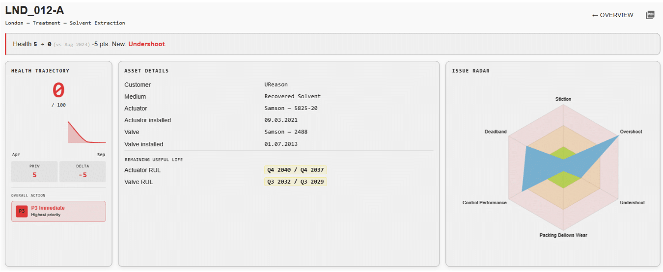 Below these tiles, a new Issues section groups all detected problems by their action priority level – P1 (Immediate), P2 (Planned), or P3 (Planned) – so you can see at a glance which valves need attention now and which can wait.
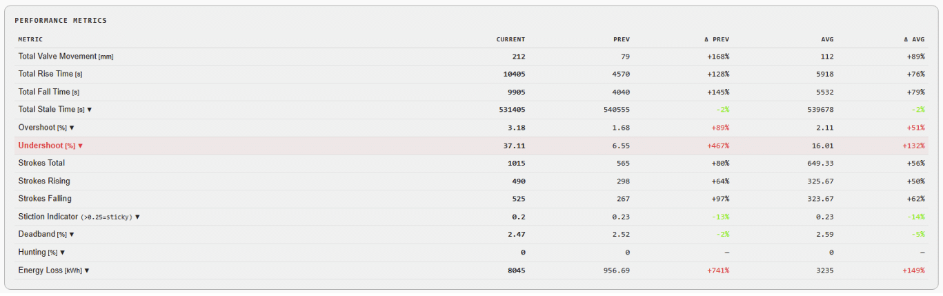
 The Performance Metrics table has also been upgraded: delta columns are now color-coded (green for improvement, red for degradation), making it much faster to scan for changes that matter.
The Overview Dashboard Gets a Major Upgrade
The fleet-level Overview Dashboard has been completely reworked. The previous pie chart and simple table have been replaced with clear KPI tiles showing the count of healthy valves, P1/P2/P3 distributions, and new recommendations. A new site-level table breaks down valve counts and priority distributions per location, with one-click drill-down to the worst valve at each site. 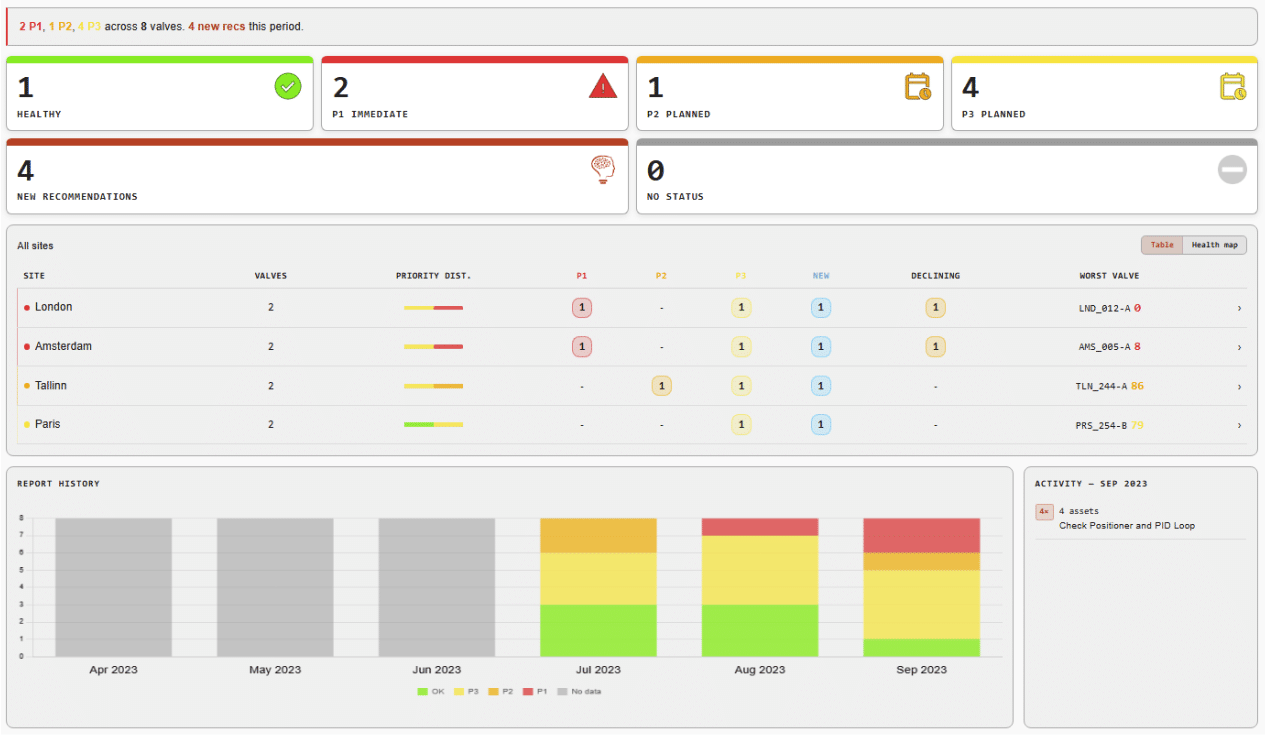
A standout addition is the Health Map view. Toggle between the traditional table and a card-based layout where each valve is represented as a tile with its health score and detected issues, color-coded by severity and ordered by priority. It’s a fast, visual way to spot the valves that need your attention. 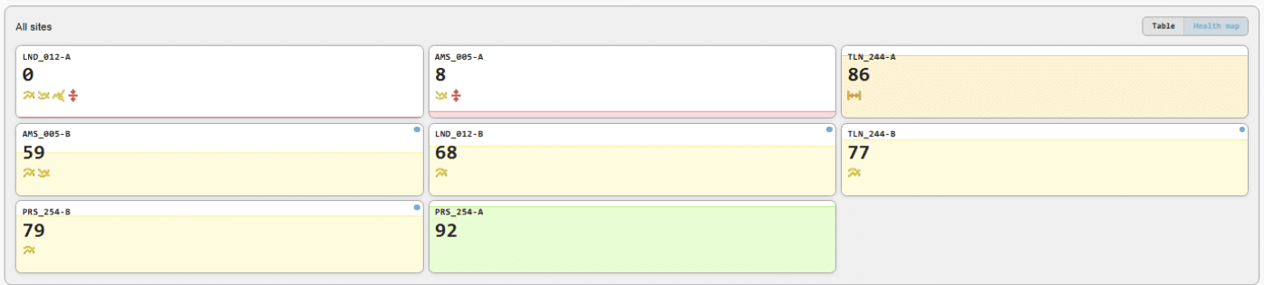
New blue-dot indicators flag valves with new issues in both the Overview and Asset dashboards, so nothing slips through unnoticed.
Period Navigation Made Easy
A small but impactful UX improvement: period navigator buttons now sit in the top right of every dashboard. Navigating to the previous or next reporting period is a single click, removing the need to go back to the filters each time. 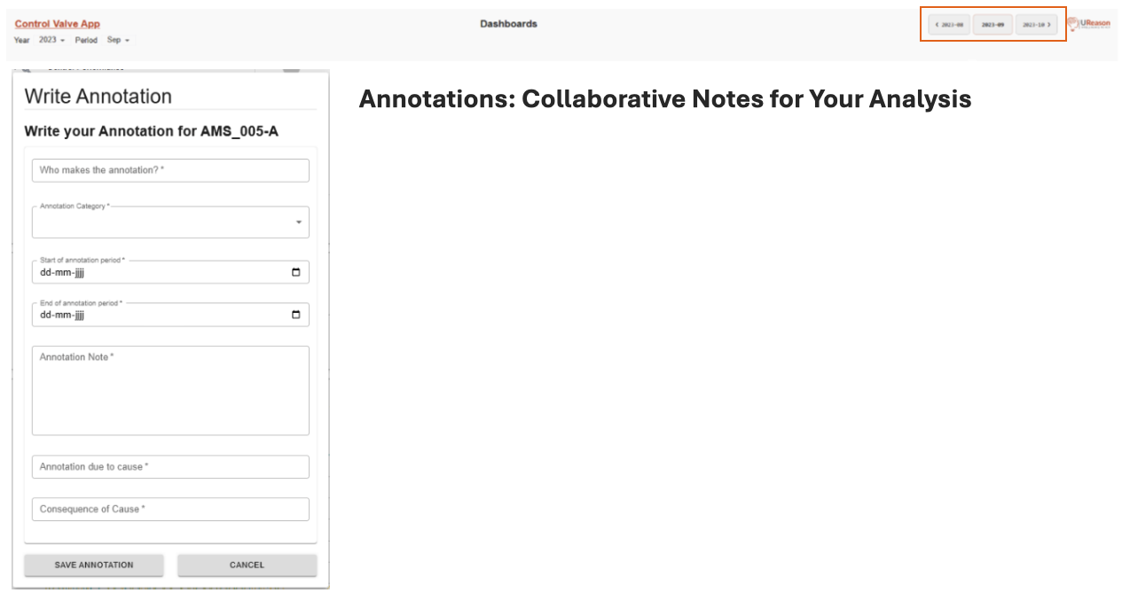
V3.0 introduces Annotations – a way for users to document context directly within the app. Found a process anomaly? Noticed something unusual during a maintenance window? Write an annotation with a category, time period, cause, and consequence. Other users on your team can see, edit, or delete these notes.
Annotations appear alongside system-generated Recommendations in a unified timeline view on both the Asset Dashboard and the Notifications page, creating a single feed of everything that’s happened with a valve or across your fleet.
Notifications: From Simple Table to Activity Timeline
The Notifications page has been reimagined as a combined Annotations & Recommendations feed. Summary tiles show total counts and the most frequently detected issue. Below, a Timeline view (or Table view – you can toggle) lists every annotation and recommendation across all periods, organized chronologically.
Repetitive recommendations now show a recurrence counter, making it easy to spot persistent issues. Edit and Delete actions are available on all user-created annotations. 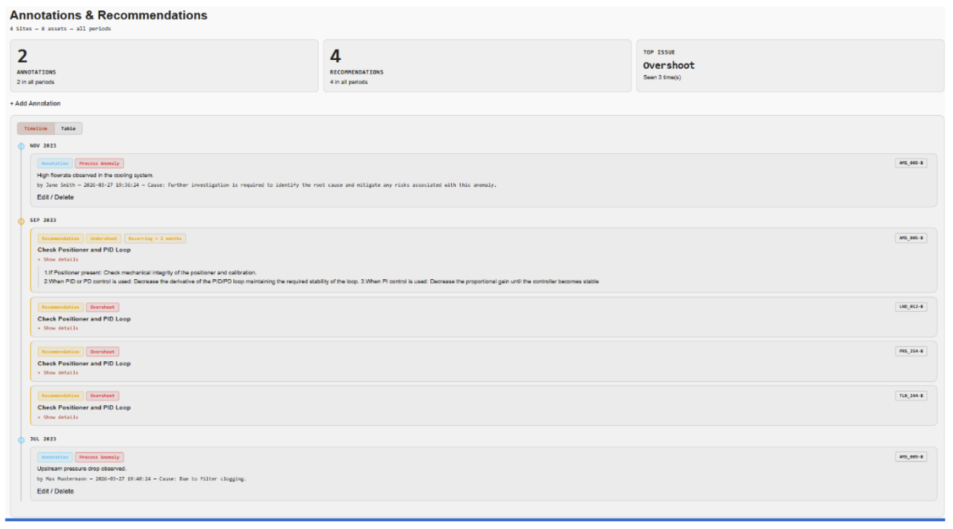
Priority Profiles: Focus on What Matters
Not every detected issue requires the same urgency. The new Priority Profile page lets you define a default profile that assigns each issue type to a priority tier. For example, if a known stiction issue has already been acknowledged, you can move it from P1 to P3, so it doesn’tdominate the dashboard.
This is just the beginning – future releases will support multiple profiles that can be assigned to individual valves or groups of valves. 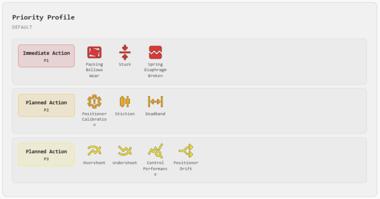
Data Overview: See Your Data at a Glance
The old data table has been replaced with a dedicated Data Overview page. Monthly bar charts for each valve show setpoint and position data counts per day, making it immediately obvious where data is present, where there are gaps, and how data volume varies across your fleet. 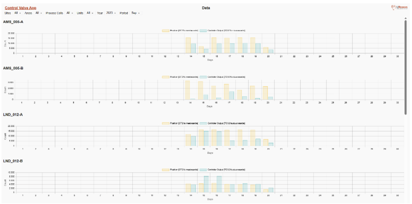
Summary of Key Changes
V3.0 is a substantial step forward in usability. The redesigned dashboards give better orientation at both the fleet and individual valve level. Annotations bring collaborative context to the analysis workflow. Priority Profiles hand control back to the customer, letting you shape the app’s output to match your operational reality. And the numerous small UX touches – period navigation, blue-dot indicators, color-coded metrics – add up to a significantly smoother experience.
We’re excited to hear your feedback. If you have questions or suggestions, reach out to the UReason support team.
See Control Valve App V3.0 in Action
Learn how Control Valve App V3.0 helps teams identify critical issues faster, improve visibility across assets, and streamline valve monitoring workflows.